Mini Case Studies
Here’s a collection of smaller projects I’ve worked on that highlight my design abilities.
I developed a cohesive icon set to improve upon an e‑commerce company’s existing collection which featured a mix of styles, lacking in uniformity. By sticking to a strict base pixel grid, each icon in my set maintains consistent visual weight and alignment. This approach improves usability and strengthens our brand identity.
Icon Set Improvement
I focused on developing a cohesive hand-lettered type set that explores various styles while maintaining consistency. By breaking the project into manageable chunks, I tackled each letter one at a time, allowing me to refine my skills and enjoy the creative process. I discovered new techniques and found that each letter became easier to craft, making the journey both fun and rewarding as I brought the full alphabet set to life.
Custom Typographic Alphabet
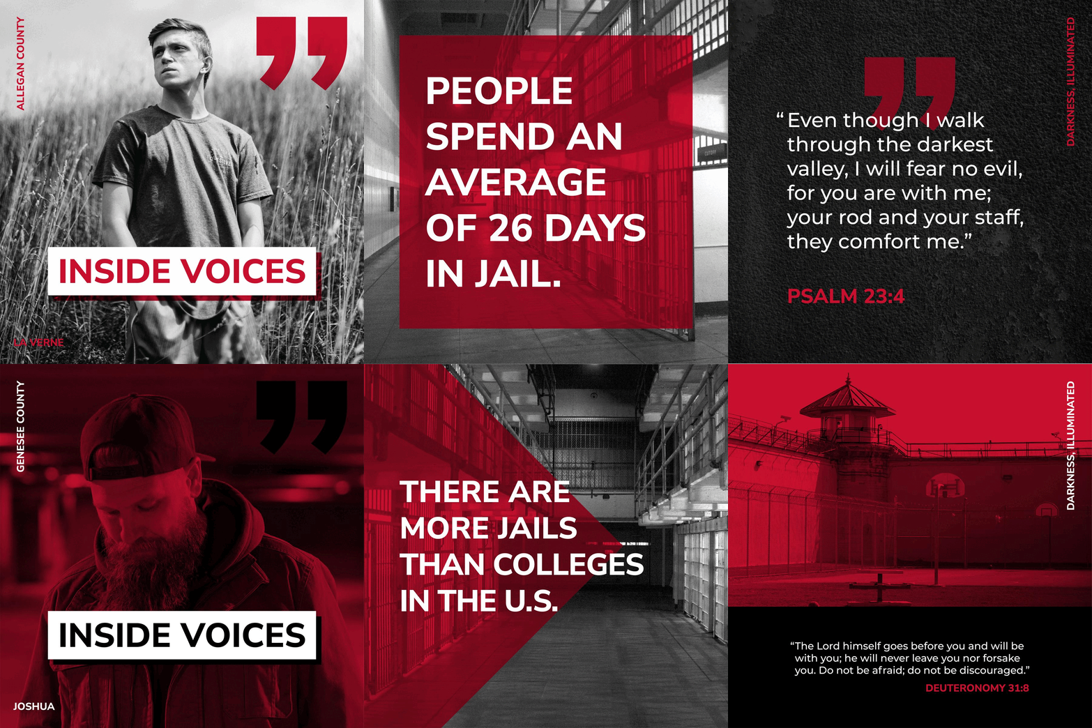
Worked on a social media template for a Jail Ministry organization. This was a fun way to experiment with the interactions between type and photography to create a cohesive series of graphics.

