Redesigning Craigslist
BRINGING THE BRAND UP TO SPEED
Craigslist is one of the world's most well-known classifieds sites, but it has not changed its branding very much since it was first created. While it has been very popular in the past, a lot of people immediately think of Craigslist’s dark history. With competitors like eBay and Facebook Marketplace gaining more popularity, Craigslist is lacking something important.
YEAR 2020
ROLE Visual Design, User Experience, Branding & Identity
But what happens if their website was organized in a different way? How can we help online buyers and sellers optimize their time in a safe, trustworthy environment?
Getting Started
To begin solving this, I started researching other successful competitors. What are they doing right? What are some things they could work on improving? What makes these other sites safer or more trustworthy? How do these sites work to help the user along, and to value their time?


With this market research in mind, I was able to draft out a game plan:
Reorganize the website’s navigation
Utilize negative space and visuals more effectively
Modernize the branding
Main Objective
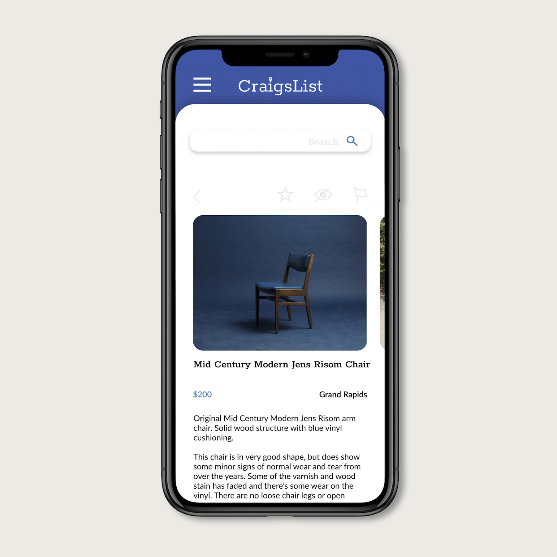
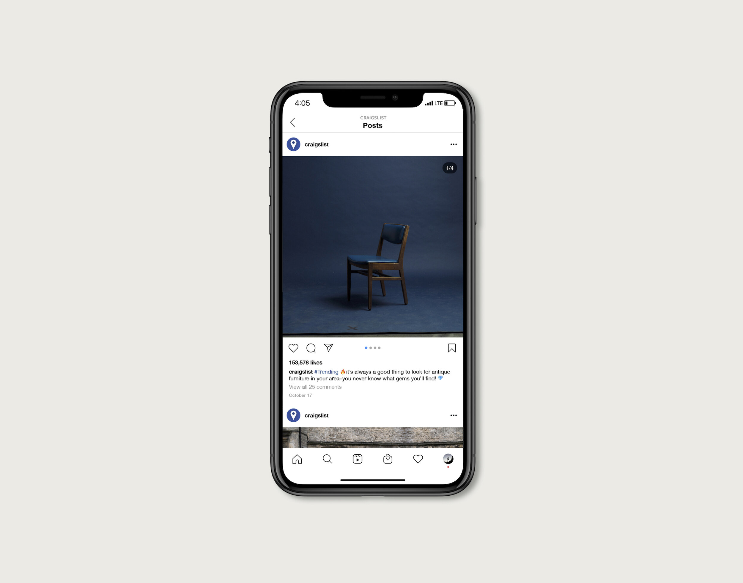
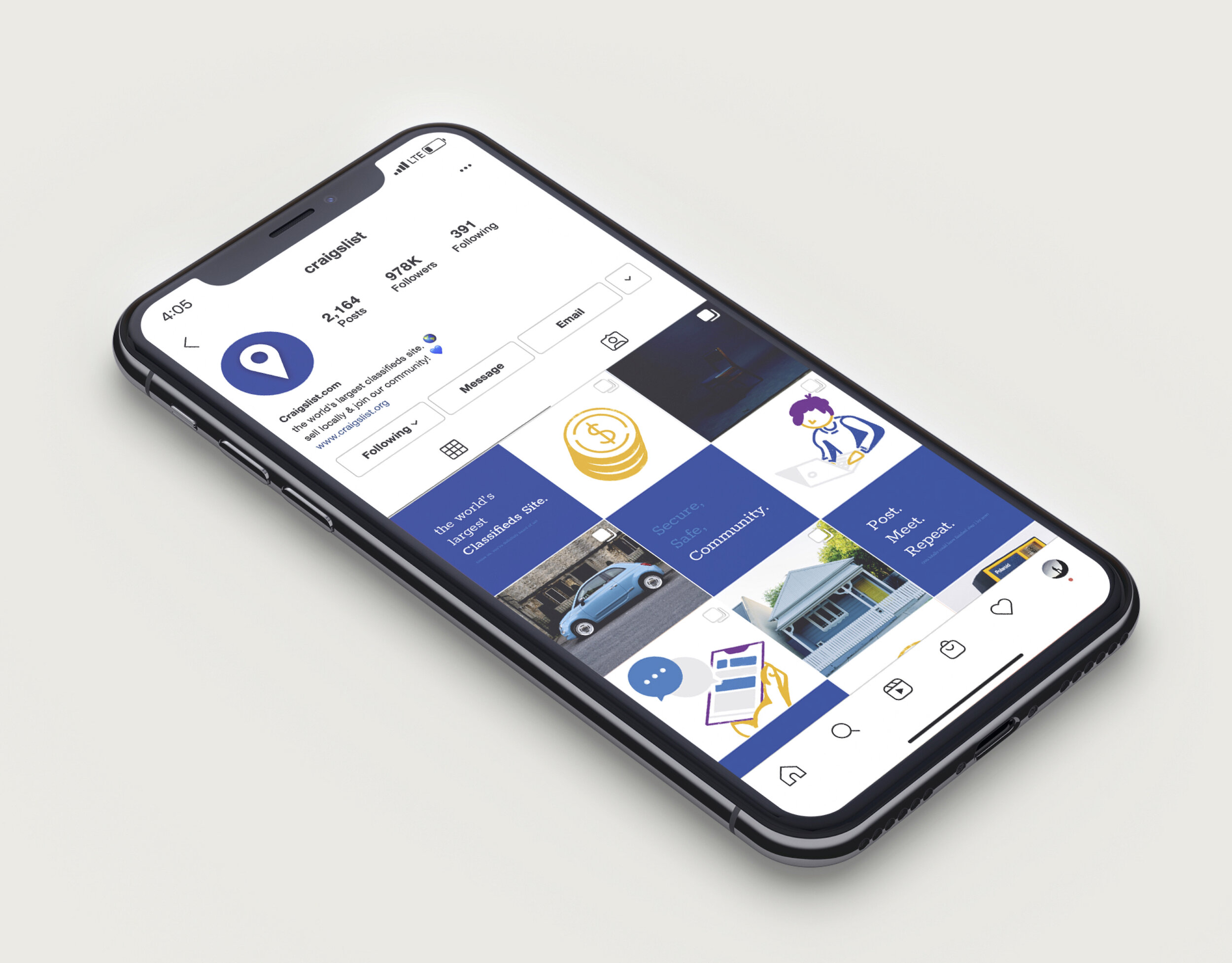
My goal for this redesign was to rework the site’s navigation to optimize the user’s interaction with the brand. I would also incorporate bright colors, soft shapes, and intentional negative space to make the brand feel relaxed, trustworthy, and safe. To do this, I would focus on the design of the website and app as well as a social media campaign.
Brand Identity
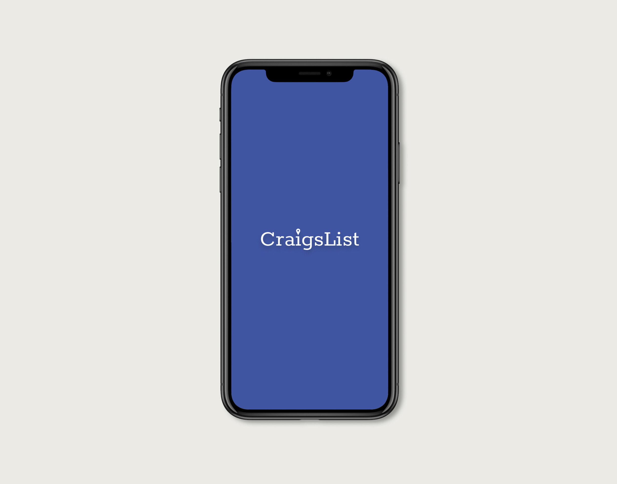
After completing my persona and market research, my next step was to sketch out a few ideas for potential logos. From there, I chose the sketches I thought were the strongest and came up with six more iterations. Finally, I developed those ideas digitally and made as many modifications as I could. Most of the logos I focused on represent the location aspect of Craigslist, as it is crucial to the company’s mission.

After choosing the logo, I took this time to make branding guidelines so I could refer to it further along the design process. I included information about the brand purpose, logo, color, and typography.


User Experience
I sketched out multiple wireframe ideas for the app and desktop site. At this stage, I primarily wanted to focus on streamlining the navigation but also thought it would be beneficial to rethink the product pages and to reduce the amount of ‘clicks’ the user needs to take to get to the product they want. These changes would provide easier access to product information so users won’t have to spend as much time searching.